Send Ad Traffic to a Landing Page, Not Your Booking Page
Sending ad traffic straight to your booking page costs you conversions. Here's when a landing page works better and how to build one that books appointments.
TL;DR: Sending paid ad traffic directly to your booking page is almost always the wrong move. A dedicated landing page converts better because it matches the ad's promise, removes distractions, and qualifies the visitor before they commit. Build one for every campaign and let the booking page do its job at the end of the funnel, not the beginning.
If you're running Google Ads or Meta campaigns and sending clicks straight to your booking page, you're probably looking at a conversion rate that disappoints you. It feels logical: someone clicks an ad for a Brazilian wax special, they land on your booking page, they book. Except that's rarely what happens.
Most visitors who hit a booking page cold freeze, especially when it shows every service you offer, every provider, and every time slot. There's too much to process and not enough reassurance. They clicked an ad that made a specific promise. The booking page doesn't continue that conversation. It drops them into a scheduling interface and expects them to figure out the rest.
The fix isn't a better booking page. It's putting the right page between the ad and the booking flow.
What a Landing Page Is Actually Doing
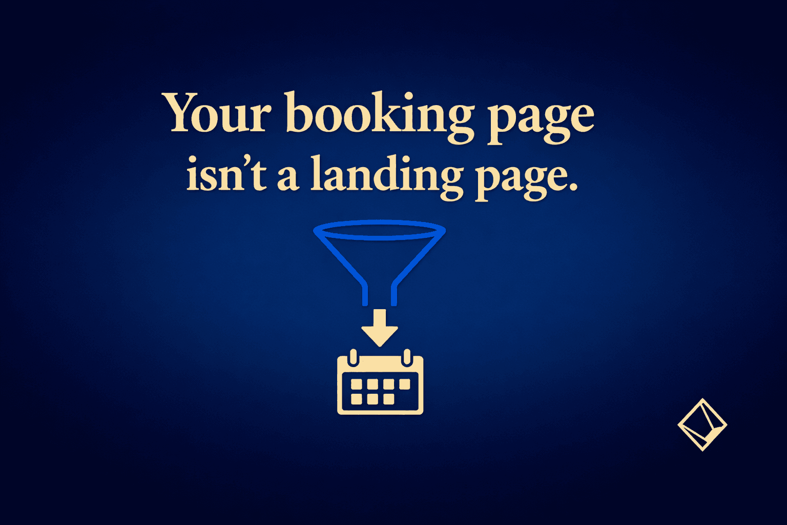
A landing page has one job: convince a visitor that they made a good click and that the next step (booking) is worth taking. It does that by carrying the ad's message forward, answering the objections that would stop someone from committing, and funneling everything toward a single call to action.
A booking page has a different job: capture the appointment details from someone who has already decided to book. It's a transaction interface, not a persuasion tool.
When you use your booking page as a landing page, you're asking one piece of software to do both jobs at once. It does neither well.
Here's the structural difference in plain terms:
- A landing page speaks to a specific offer or service. A booking page shows everything.
- A landing page removes navigation so visitors can't wander to your about page or your retail menu. A booking page is embedded in your site or platform.
- A landing page addresses hesitation ("Is this right for me? Is this business credible? What does this cost?") before asking for commitment. A booking page assumes those questions are already answered.
- A landing page ends with one button. A booking page ends with a form.
The booking page is still necessary. It just belongs at the end, after the landing page has done its work.
When You Can Skip the Landing Page
Landing pages take time to build and test. For some campaigns, the simpler setup is fine.
You probably don't need a dedicated landing page if:
- Your campaign is pure brand awareness and you're not paying per click on a conversion-focused goal
- The ad itself is a direct rebooking prompt aimed at your existing client list (someone who already knows you doesn't need convincing)
- You're running a very low-budget local campaign just to maintain visibility, and the volume doesn't justify the build time
You almost certainly do need one if you're spending real money on Google Search Ads or Meta lead campaigns, targeting people who have never heard of you. The Google Ads campaigns Tersavia manages route traffic to dedicated landing pages for exactly this reason: the click cost is too high to waste on a page that wasn't built to convert strangers.
What Goes on a High-Converting Landing Page for a Spa or Salon
The anatomy of a landing page that actually works isn't complicated. The problem is that most spa and salon owners either skip the page entirely or build something too generic.
Here's what earns the booking:
The headline matches the ad. If your ad says "$79 Hydrafacial, First Visit," your landing page headline says the same thing. Word for word if possible. The moment a visitor sees something different from what the ad promised, trust drops.
One service, explained clearly. Describe what the treatment is, how long it takes, what the client should expect during and after. Don't link out to your full menu. Don't mention your other services. This page is for this offer.
Social proof close to the fold. Two or three real client reviews specific to the treatment convert better than a generic five-star badge. "I came in skeptical about Hydrafacial and left with the best skin of my life" does more work than "Great place, 5 stars."
One visible price. Ambiguity about cost is one of the top reasons people leave without booking. If the price is on the ad, it needs to be on the page too. Hiding it to get the phone call isn't clever. It just gets you a page exit.
A single call to action. One button. "Book Now" or "Claim This Offer." Not three buttons, not a contact form alongside a booking link, not a newsletter signup at the bottom.
No navigation bar. This is where most small businesses lose the plot. They build a decent landing page and then leave the site header intact. Visitors click to your gallery, your team page, your blog, and you've lost the thread. A landing page strips the header down to your logo and phone number, nothing else.
The Booking Page Still Has to Work
Even a perfect landing page hands a visitor off to a booking page at the end. If that experience is clunky or confusing, you've lost the conversion at the last step.
A few things that kill conversions at the booking stage:
- The service from the landing page isn't easy to find in the booking flow. If your visitor has to scroll past fifteen services to find "Hydrafacial," some of them won't.
- The first available appointment is two weeks out with no waitlist option. You may want to fill last-minute cancellations before the slot goes cold to keep that calendar tighter.
- The page asks for too much information before confirming the booking. Name, email, and phone number are reasonable. A paragraph about health history can wait for an intake form sent after the booking is confirmed.
- There's no deposit prompt or cancellation policy visible. Some visitors want to know what they're committing to before they finalize.
Think of the landing page and the booking page as handoff partners. The landing page gets the visitor ready to say yes. The booking page needs to receive that yes cleanly.
How to Test Whether Your Landing Page Is Working
You don't need a complex analytics setup to tell whether your landing page is doing its job. Watch three numbers:
- Bounce rate on the landing page. A very high bounce rate (above 70-80% for paid traffic) usually means the page doesn't match what the ad promised, or the page is too slow to load on mobile.
- Click-through rate from the landing page to the booking page. This is the landing page's conversion metric. If fewer than 10-15% of landing page visitors click through to book, something on the page is creating friction.
- Booking completion rate from the booking page. If visitors land on the booking page but don't complete, the problem is in the booking flow itself, not the landing page. That's a different fix.
A useful reference point: how you structure your Google Ads budget relative to your average ticket affects how many clicks you need to see statistically meaningful data on any of these numbers. Don't judge a landing page on 30 clicks. Give it 100-200 before drawing conclusions.
For campaigns with a specific service or offer, also check whether the offer itself is the bottleneck. Sometimes the landing page is fine and the ad is targeting people who were never going to buy that service.
FAQ
Should I build a separate landing page for every ad campaign I run?
Not necessarily for every ad, but yes for every distinct offer or audience segment. A campaign promoting a first-visit facial deal needs a different landing page than one promoting a membership. Sending both to the same page weakens both.
Can my booking page double as a landing page if I design it well?
Rarely. Booking pages are built to capture appointment details, and most platforms give you limited control over the surrounding copy, navigation, and layout. A booking page that looks like a landing page still doesn't let you strip the navigation, write the headline you want, or place social proof where it does the most work. The two pages have different jobs.
What should my landing page look like on mobile?
Most paid ad clicks come from phones, so mobile isn't a secondary concern. The headline and the booking button should both be visible without scrolling. Load time matters: a page that takes more than three seconds to load on a mobile connection loses a significant share of visitors before they see anything. Compress your images and keep third-party scripts minimal.
How do I know if my low conversion rate is a landing page problem or a booking page problem?
Track the click-through rate from the landing page to the booking step separately from the completion rate on the booking page. If visitors are clicking through to the booking page but not completing, the problem is in the booking flow. If they're leaving the landing page without clicking at all, the problem is the landing page. The call-to-booking conversion rate post covers some of the same diagnostic thinking for phone traffic, and the logic transfers.